Buttons Font Review: A Designer’s Practical Take
First Impressions: Tactile Warmth in Digital Form
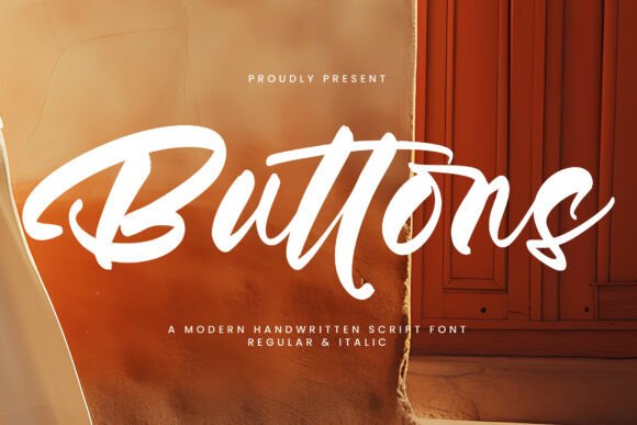
When evaluating a new typeface for client work, my first question is never about the number of glyphs or OpenType features. It is always about feeling. Does this font have a pulse? With Buttons, the answer is an immediate yes. As a script font from Script Amp, it avoids the sterile perfection that plagues so many digital scripts. Instead, it offers a tactile, almost handmade quality that feels like ink on textured paper.
The mood Buttons creates is distinctly approachable yet refined. It does not scream for attention with aggressive swashes or chaotic baselines. Rather, it whispers with confidence. The letterforms possess a gentle bounce and organic rhythm that suggests human touch without sacrificing legibility. For a designer, this balance is critical. We often search for a creative font that adds personality to a layout without compromising the professional integrity of the project. Buttons sits comfortably in that sweet spot, making it a strong contender for brands that want to feel personal, artisanal, or boutique.
Real-World Application: Where Buttons Earns Its Keep
A font’s true value is revealed only when it leaves the specimen sheet and enters production. In my recent evaluations, I tested Buttons across several high-stakes deliverables to see how it performs under pressure.
Brand Identity and Logo Design
In logo design, Buttons shines as a primary logotype for lifestyle and wellness brands. The connections between letters are fluid but distinct, ensuring the mark remains recognizable even when scaled down for business cards or social avatars. Unlike many display fonts that require extensive customizing to look unique, Buttons has enough inherent character to stand alone as a wordmark. However, for brand identity systems, I recommend using it strictly for the primary logo or signature accents. Pairing it with a clean sans serif font for subheads and body copy ensures the brand remains versatile and readable across all touchpoints.
Packaging and Product Labels
This is arguably where Buttons excels most. In packaging design, particularly for cosmetics, specialty foods, or craft goods, the font conveys a sense of premium care. On a matte label or textured box, the organic strokes of Buttons suggest small-batch quality. I found it particularly effective for short product names or flavor descriptors. Because the x-height is generous for a script, it maintains presence on shelf displays without needing excessive scaling. Just be mindful of contrast; this premium font needs breathing room to avoid looking cluttered against busy background patterns.
Digital Products and Social Media Graphics
For content creators and digital sellers, Buttons is a reliable workhorse for social media graphics and thumbnails. In the fast-scrolling environment of Instagram or Pinterest, its distinctive silhouette stops the eye. I have used it successfully in Canva templates and printable design assets like planners and wedding invitations. The key here is hierarchy. Use Buttons for the main hook or title, but revert to a sturdy serif font or simple sans serif for details like dates, prices, or URLs. This ensures your digital product looks polished rather than amateurish.
Strategic Restraint: Knowing When to Hold Back
No typeface is a universal solution, and part of professional judgment is knowing where a tool fails. Buttons is a specialized instrument, not a blunt one. There are specific contexts where I would advise against its use.
- Long-Form Body Text: Never set paragraphs in Buttons. It is a display font designed for impact, not endurance. Reading more than a few words in this style causes fatigue and degrades user experience.
- All-Caps Settings: Like most connected scripts, Buttons loses its charm and legibility when forced into uppercase. The connecting strokes break, creating awkward gaps. Stick to title case or lowercase for optimal flow.
- Highly Technical or Corporate Contexts: If you are designing for finance, law, or heavy industry, the softness of Buttons may undermine the necessary tone of authority and precision. Reserve it for sectors where emotion and connection are assets.
- Micro-Sizes: Below 14pt (or equivalent pixel size), the delicate terminals and thin connectors may disappear in print or blur on low-resolution screens. Always test at actual output size.
The Impact on Hierarchy and Audience Trust
Typography is non-verbal communication. When you choose Buttons, you are signaling to the audience that the content is curated, thoughtful, and human-centric. This directly affects perceived value. In editorial design, using Buttons for pull quotes or chapter titles breaks up dense text and invites the reader to pause. It creates a visual rhythm that keeps engagement high.
However, trust is built on consistency. If you use Buttons sporadically or inconsistently, it can look accidental. Establish clear rules in your style guide: perhaps Buttons is only used for testimonials and special offers, while headers remain in a structured sans serif. This disciplined approach to modern typography ensures the font enhances the message rather than distracting from it. When used correctly, Buttons elevates the entire composition, making commercial assets feel bespoke and intentional.
Designer’s Notebook: Practical Testing Protocols
Before licensing or deploying Buttons for a live project, run through this evaluation checklist. These steps separate hobbyist choices from professional decisions.
- The Black and White Test: Strip away color and effects. Does the font still hold its weight in solid black on white? If it relies on gradients or shadows to look good, it is not robust enough for versatile design assets.
- Font Pairing Stress Test: Place Buttons next to your intended secondary fonts. Check the optical alignment. Does the baseline match? Is the contrast in weight sufficient? I find it pairs beautifully with geometric sans serifs for a modern look, or traditional serifs for a classic editorial feel.
- Mockup Validation: Never judge solely on screen. Print it out. View it on a phone. Put it on a realistic packaging mockup. Context reveals flaws that isolated viewing hides.
- Licensing Verification: This is non-negotiable. Confirm whether your license covers web design, app embedding, or merchandise resale. Script Amp typically provides clear licensing tiers, but always read the EULA. Using a commercial font without proper rights exposes clients to legal risk.
- Spacing Review: Check the kerning pairs. While Buttons is well-spaced out of the box, specific letter combinations in your brand name might need manual adjustment. Professional polish lies in these micro-details.
Final Verdict for Creative Professionals
Buttons is more than just another pretty script; it is a functional design tool with a distinct point of view. It brings warmth to web design, authenticity to packaging design, and engagement to social content. For designers, marketers, and small business owners seeking to infuse their work with genuine personality, it is a worthy investment.
Its success depends entirely on restraint and context. Treat it as a spice, not the main course. Respect its limitations regarding readability and scale, and leverage its strengths in emotional connection and visual texture. When applied with professional judgment, Buttons transforms generic layouts into memorable brand experiences. It is a testament to the fact that in an era of AI-generated perfection, there is still immense value in type that feels undeniably, imperfectly human.